CEDAR HOUSE
Location: Clyde Hill, Washington
Type: Residential
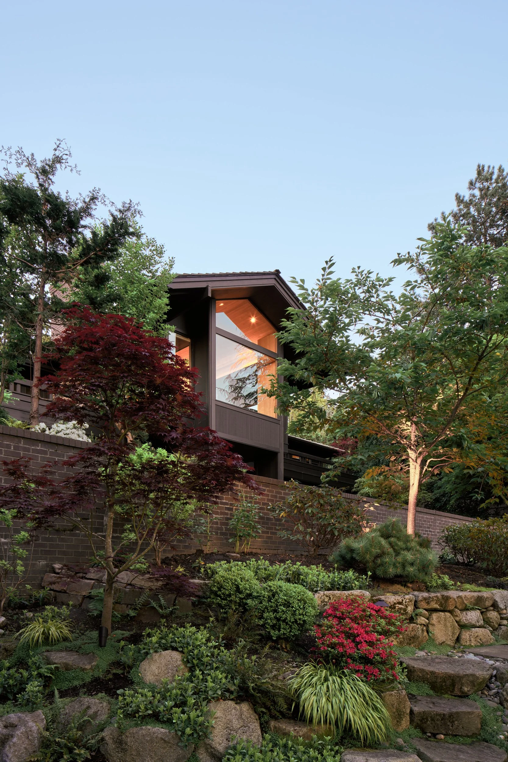
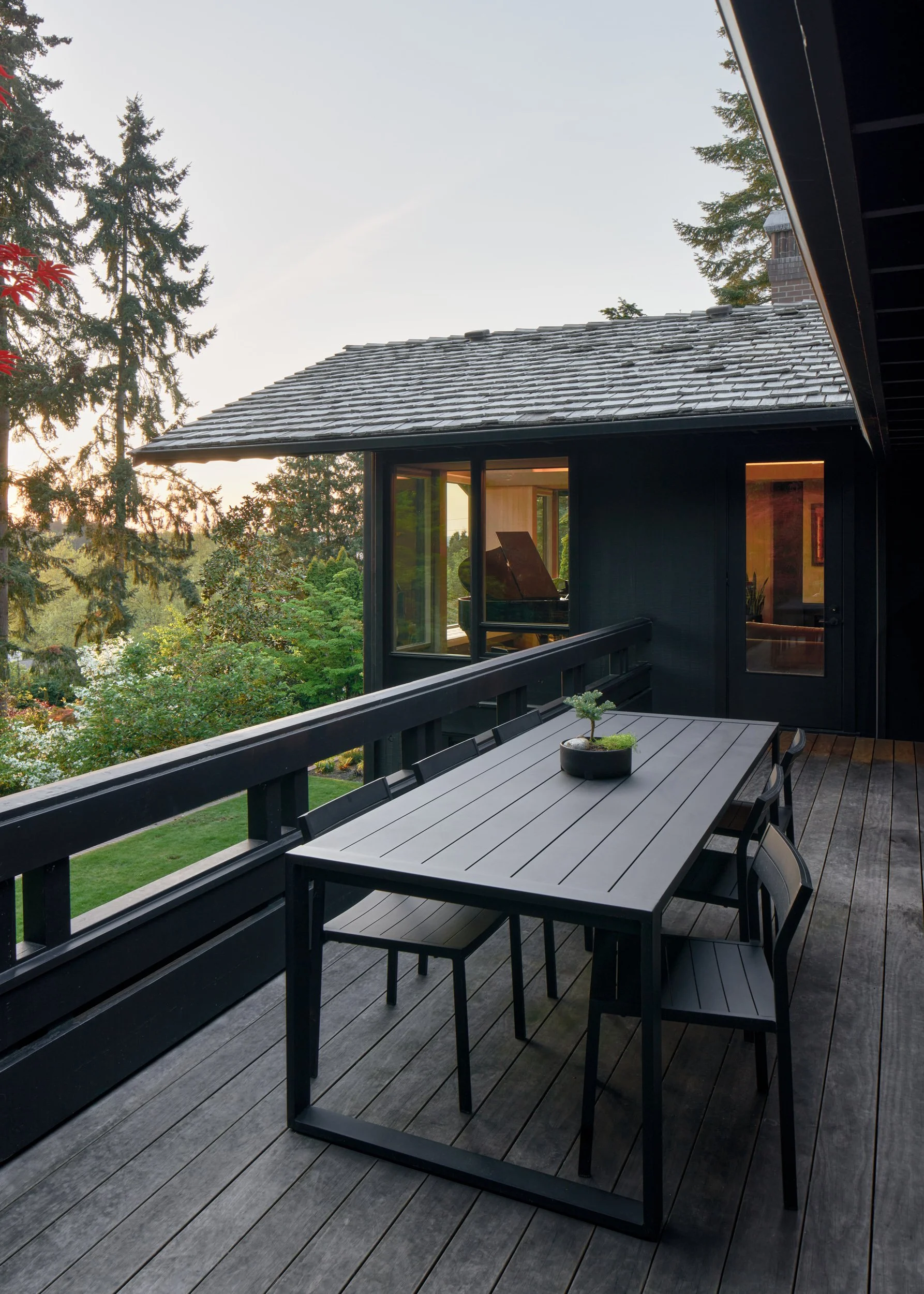
The owners of this mid-1970s house came to the design team looking to update and refresh their home without sacrificing the spirit of wood that makes it a quintessential example of its time. Originally designed by noted Pacific Northwest architect Ralph Anderson, the house sits high on a sloping site. Nestled into the heavily landscaped terrain, it serves as a quiet escape from what is an otherwise typical suburban location. The design challenge was to bring the house up-to-date without sacrificing its essential character; the solution was a two-track approach to the remodel. Public spaces—the entry and dining room, those areas most defined by their use of cedar—would receive a light touch, while private areas of the home—areas receiving the heaviest use and needing the most updates—would be modernized and updated for contemporary living. Throughout all areas, updates to the home were carefully considered to honor the original design.
Despite falling outside of the traditionally accepted definition of mid-century modern, the home captures the ideals associated with it while translating them into a particular expression of Pacific Northwest regionalism that features a heavy dose of Pacific Rim influence. The owners, originally from Hawaii, were in part drawn to the house for its aesthetic kinship to the design they experienced in their youth.
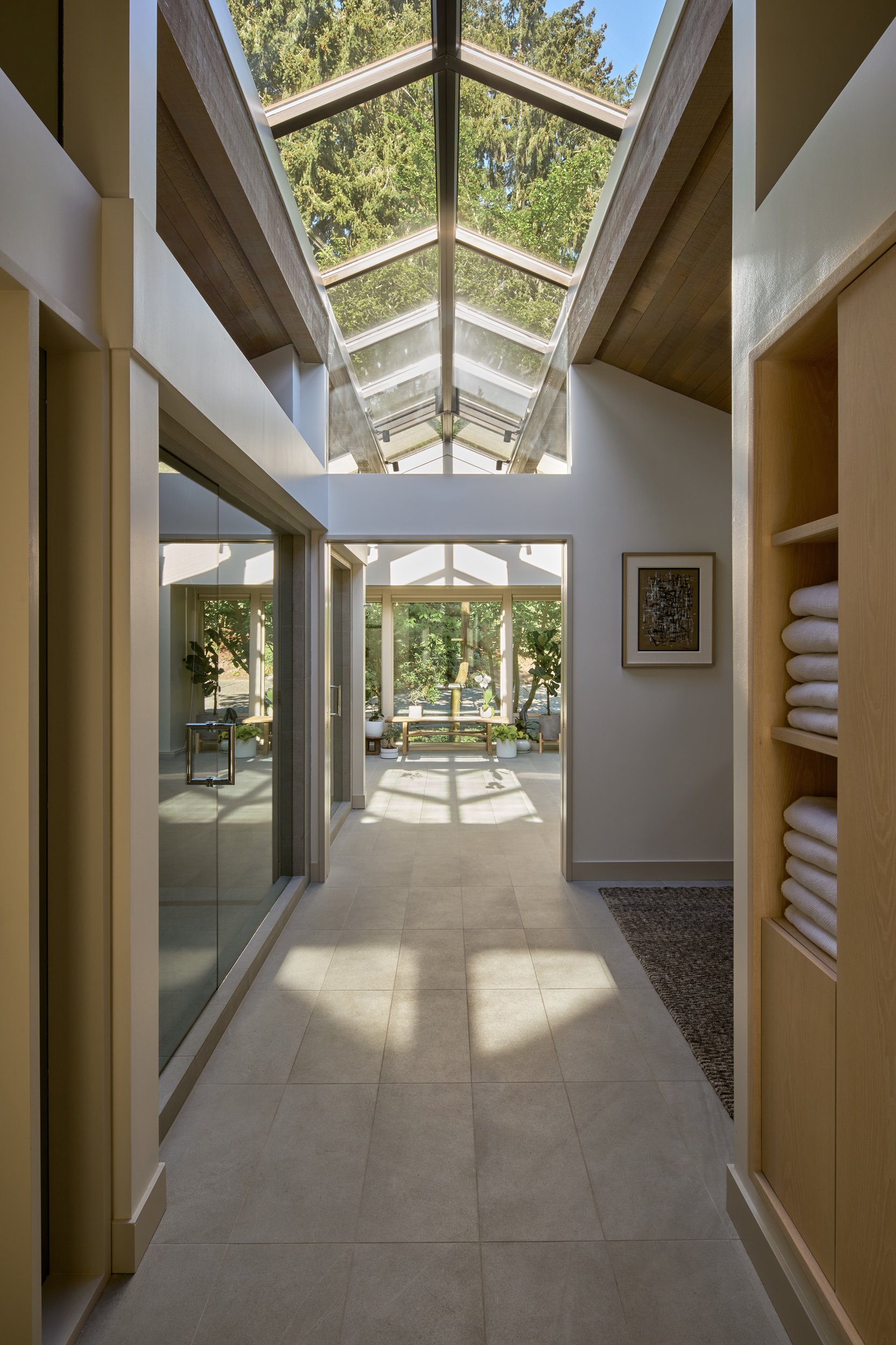
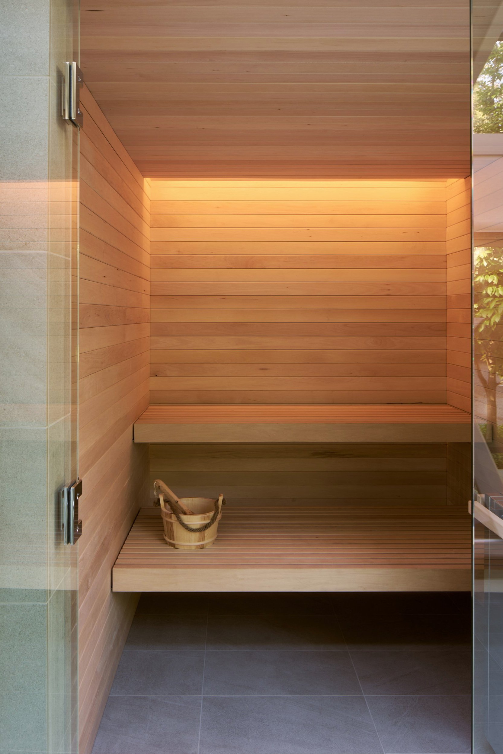
The tall, vaulted foyer—the central axis of a T-shaped plan—sets the tone for the experience. The visitor is greeted with cedar-clad walls, ceilings, and soffits which reappear throughout the house. The most preserved space in the house, work here was limited to lighting updates. The living and dining rooms, the two other spaces receiving minimal work were updated with new lighting and rift sawn white oak flooring. Elsewhere in the house, brightening the interiors was a priority and interventions were strategically allocated to make the most impact. Drywall and Milestone were introduced to create a light, reflective wall surface to areas where the cedar had become monochromatic and dark. Flooring throughout the house was replaced and upgraded to rift sawn white oak with a custom stain. The existing lighting was updated with modern LEDs calibrated to cast soft light on the cedar walls and ceilings. All finishes were carefully tested and reviewed on site to fine-tune their relationship to the existing interiors, resulting in a subtle, refined collection of wood, steel, stone, and plaster.
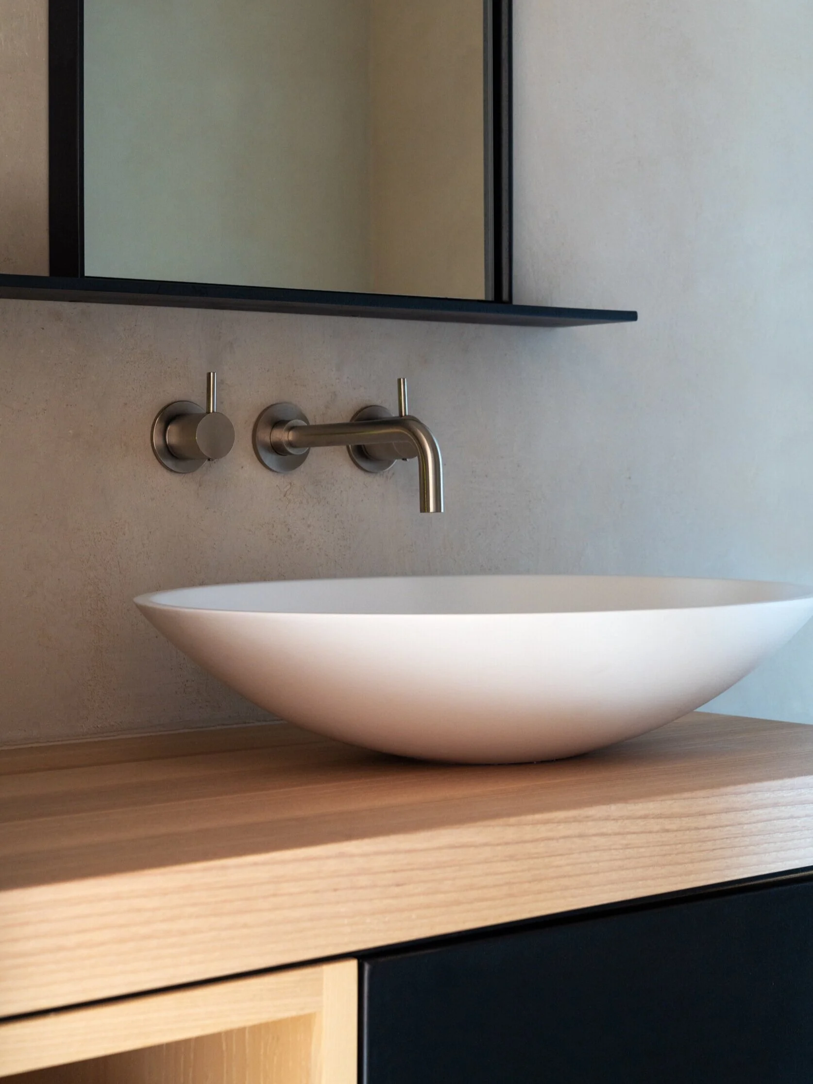
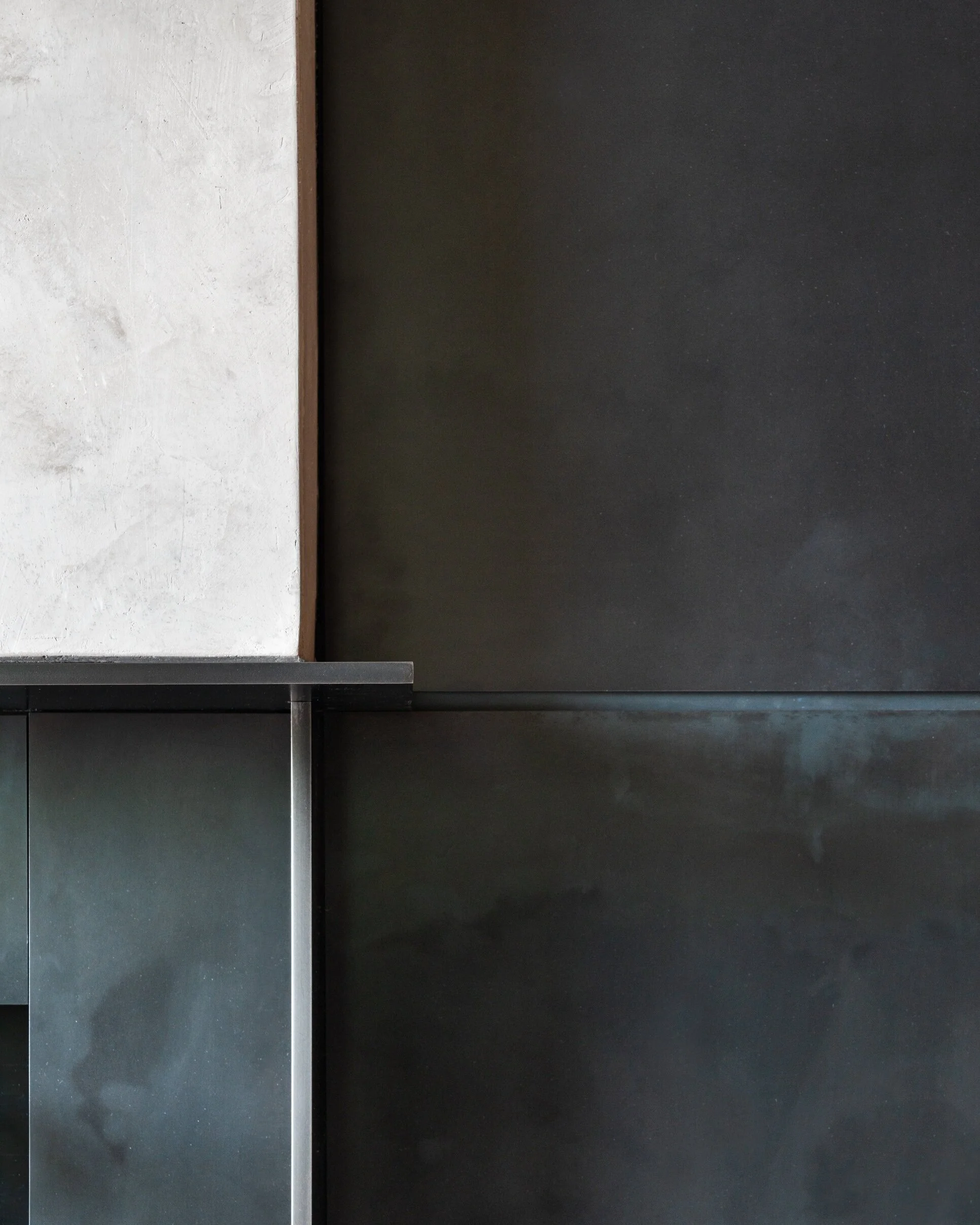
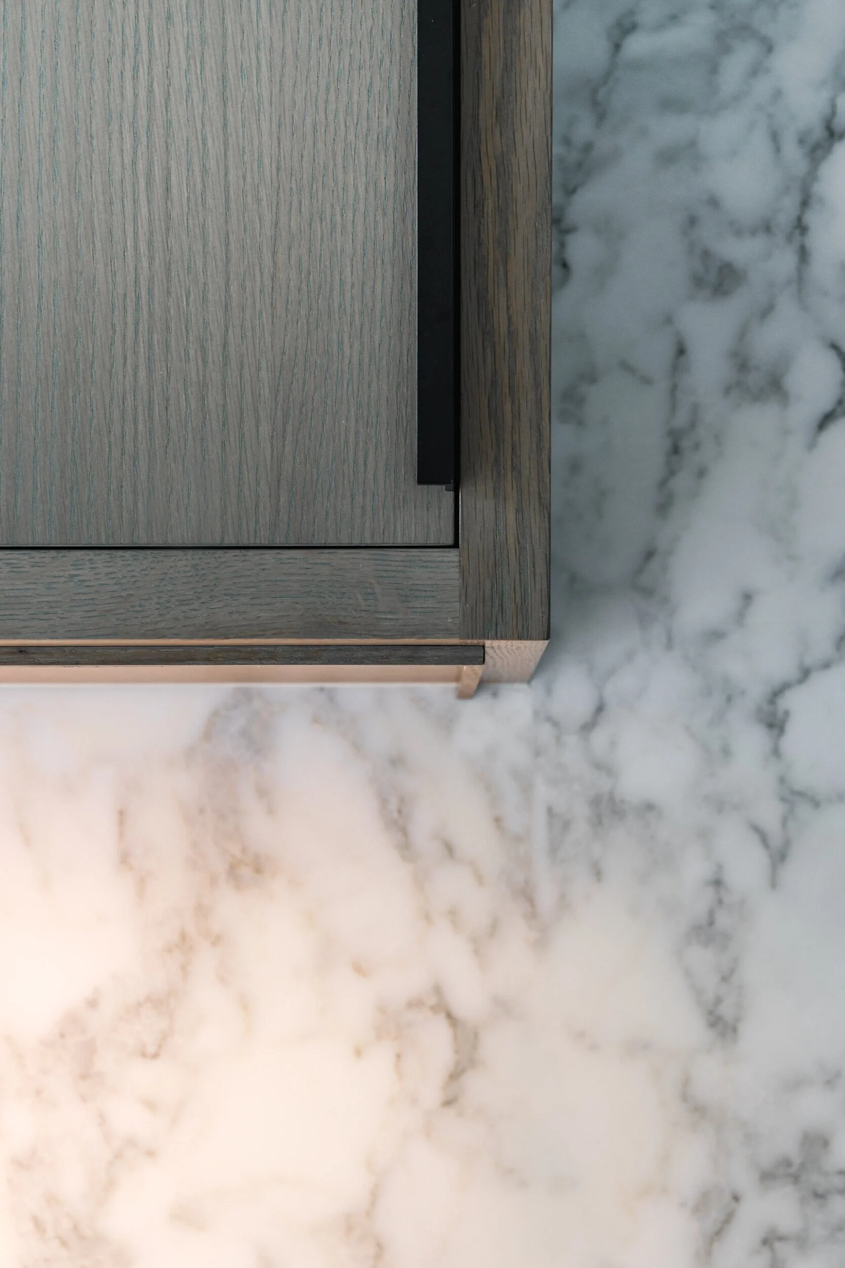
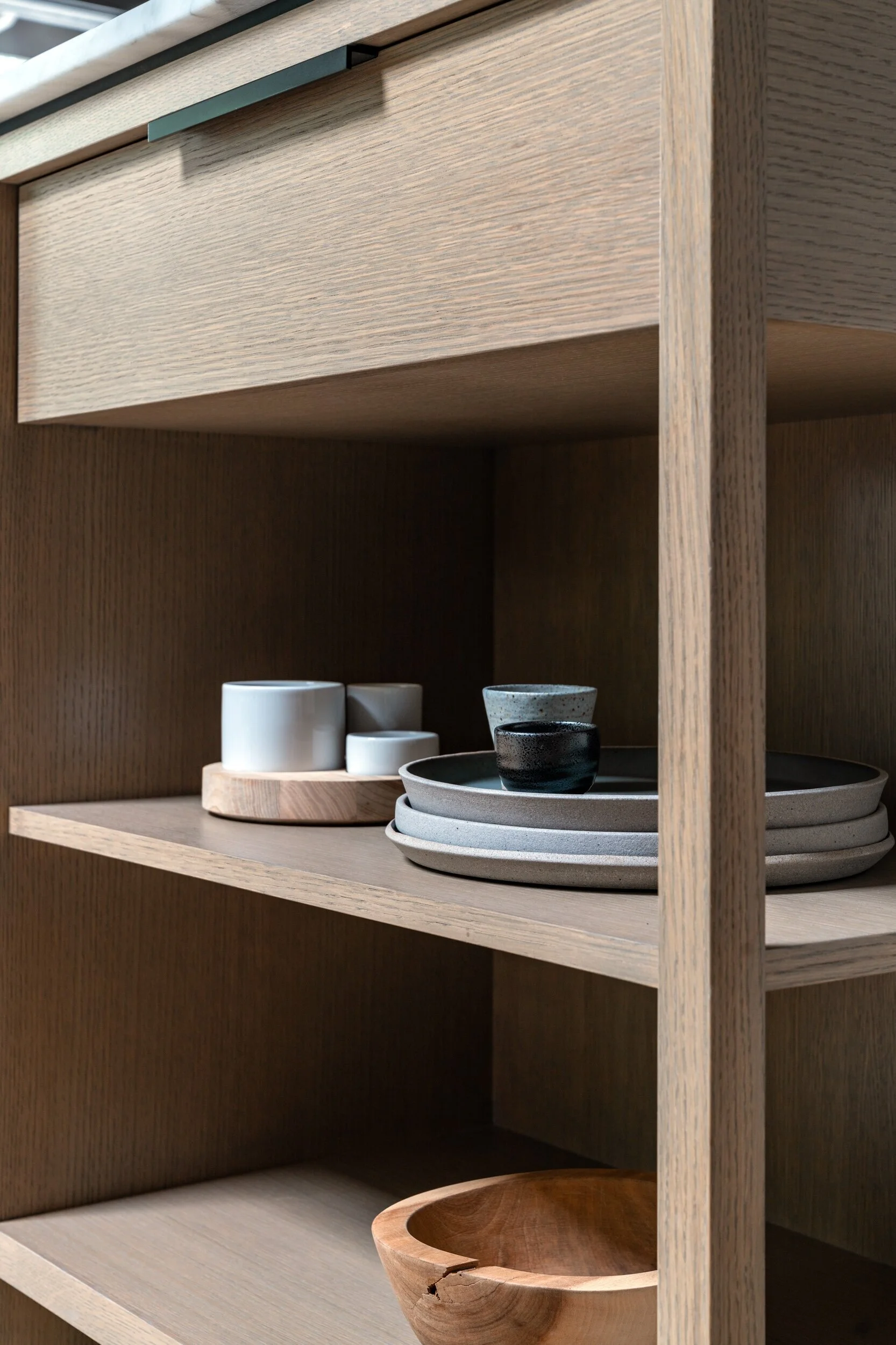
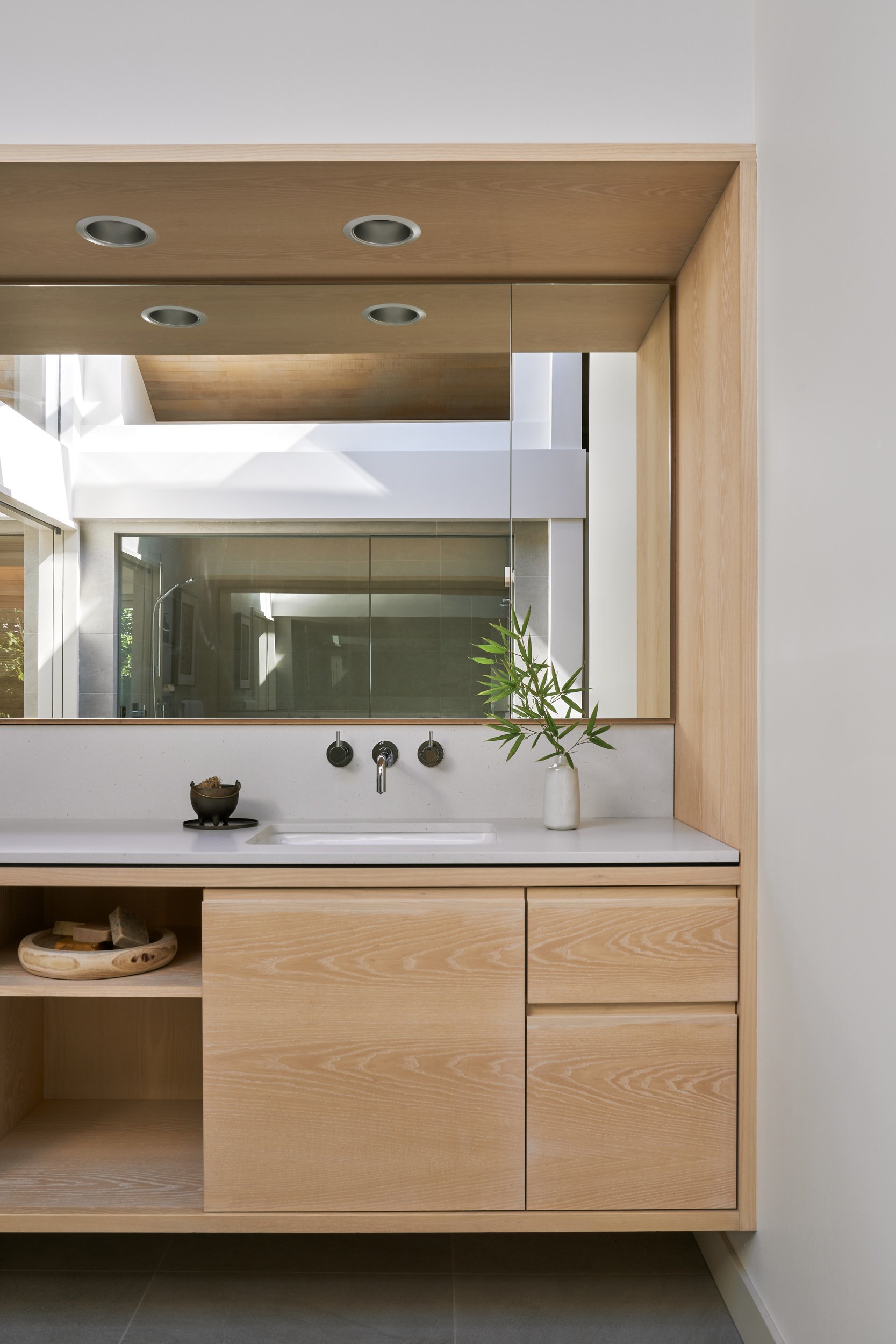
The kitchen and family room, which were taken back to the original framing, saw the most change. The kitchen—which had been previously altered—was outdated and finished in materials that made the room overly dark. New, lighter finishes were introduced, including a Calacatta marble counter and backsplash, drywall, and custom white oak cabinetry. The marble-topped island, designed to resemble a piece of furniture more than built-in cabinetry, is the heart of the space, offering a place for cooking, gathering, and entertaining. In the living room, the fireplace finishes were replaced with a minimal steel and Milestone hearth and surround. Custom light fixtures over the entry, contemporary lanterns that play off the wood detailing of the original house, were the result of a collaboration between the owner and a local lighting fabricator. The office, a creative work-at-home space, called for new drywall to provide sufficient ambient light. The custom built-in desk is made of ash millwork and features a steel pin-up board above, while porcelain white board paneling offers an expansive wall surface for sketching and a magnetic surface for pin-up. The powder room required thoughtful moves to feel more spacious. A tankless toilet, wall-mounted faucet, and vessel sink paired with open shelving opens up the space, while the subtle texture of milestone replaces the previously dark walls to create a calming, spa like atmosphere. A future phase of work will continue with an upgrade of the master bathroom and conversion of the basement into a studio.
Photography: Haris Kenjar, Ross Eckert
Original Architect: Ralph Anderson
Interior Design: Graham Baba Architects
Contractor: Dovetail
Lighting/AV Design/Elec Eng: Cascade Integration

